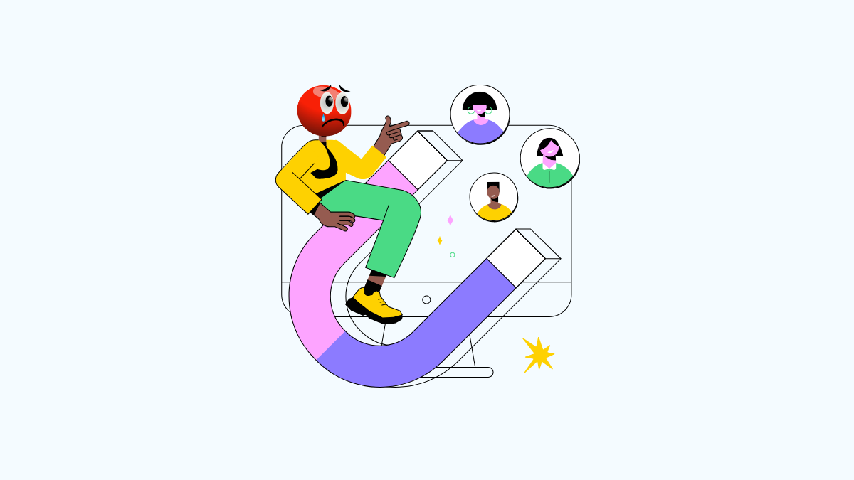
You’ve built a beautiful website. You’ve invested time, money, and energy into making it look great. There’s just one problem: it’s not generating any leads.
The phone isn’t ringing, your inbox is empty, and you’re starting to wonder what went wrong. You're not alone. Many businesses face this exact challenge.
The good news is that the fixes are often straightforward. Your website might just have a few common issues that are turning potential customers away.
We’re going to break down the ten most likely culprits, from slow page speed to confusing offers.
Use this as your checklist to transform your website into a lead-generating machine. Let's dive into the reasons your site isn't converting and find out how to fix them.
TL;DR
-
First Impressions Matter: Weak headlines and slow-loading pages cause visitors to leave immediately.
-
Guide Your Visitors: Clear navigation and visible Calls-to-Action (CTAs) are essential for showing users what to do next.
-
Build Trust: Social proof like reviews and clear, valuable offers convince people to engage.
-
Remove Friction: Complicated forms and a poor mobile experience will frustrate users and cost you leads.
-
Capture Interest: Use lead magnets to offer value in exchange for contact information.
Weak Headlines That Fail to Grab Attention
Your headline is the first thing a visitor reads. It has one job: to convince them to keep reading. If it’s bland, confusing, or irrelevant, they’ll hit the back button without a second thought. People scan content online, and you have about three seconds to capture their interest.
How to Write Better Headlines
-
Be Ultra-Specific: Instead of "Our New Services," try "Custom Web Design for Small Businesses."
-
Focus on the Benefit: Don't just say what you do. Explain what’s in it for the customer. "Save 10 Hours a Week on Admin Tasks" is better than "New Automation Software."
-
Use Numbers: Headlines with numbers often get more clicks. For example, "5 Ways to Improve Your Marketing ROI."
-
Create Curiosity: Make them want to know more. "The One Thing Your Competitors Don't Want You to Know."
Slow Page Loading Causing Users to Bounce
Patience is not a virtue online. If your website takes more than a few seconds to load, most visitors will leave. A slow site feels unprofessional and frustrating. This high bounce rate tells search engines that your site provides a poor user experience, which can also harm your rankings.
Why Speed Is Critical
-
Conversion Rates: A one-second delay in page load time can result in a 7% reduction in conversions.
-
User Experience: Fast-loading sites feel more efficient and reliable.
-
SEO: Google uses page speed as a ranking factor for both desktop and mobile searches.
Hidden CTAs That Are Hard for Visitors to Find
Your Call-to-Action (CTA) is the most important button on your page. It’s the "Buy Now," "Contact Us," or "Download Free Guide" button that turns a visitor into a lead. If your CTAs are buried, blend into the background, or are nonexistent, you’re leaving money on the table.
Making Your CTAs Stand Out
-
Use Contrasting Colors: Make your CTA buttons pop. If your site is blue, use an orange or green button.
-
Write Action-Oriented Text: Use verbs that prompt action. "Get Your Free Quote" is stronger than "Submit."
-
Place Them Strategically: Put CTAs where the eye naturally falls—at the top of the page, after key sections, and at the end of your content.
Mobile Errors Ruining the User Experience
More than half of all web traffic comes from mobile devices. If your site looks broken, is hard to navigate, or requires pinching and zooming on a phone, you’re alienating the majority of your audience. A non-responsive design is no longer an option; it's a requirement.
Common mobile issues include:
-
Text that is too small to read.
-
Buttons that are too close together to tap.
-
Content that is wider than the screen.
-
Pop-ups that are impossible to close.
No Social Proof or Trust Signals Like Reviews
People trust other people. Before they hand over their email address or credit card number, they want to know that you’re legitimate and that you deliver on your promises. Social proof builds that trust. Without it, your claims feel empty.
Types of Social Proof to Add
-
Customer Testimonials: Direct quotes from happy clients.
-
Case Studies: In-depth stories of how you helped a customer succeed.
-
Logos of Past Clients: Shows you’ve worked with other reputable brands.
-
Star Ratings & Reviews: Integrations from Google, Yelp, or industry-specific review sites.
Vague Offers That Don't Explain the Value
"Contact us for more information" is not a compelling offer. Why should someone contact you? What will they get? If your offer is vague, visitors won't understand its value, and they won't take action. You need to be crystal clear about what the user will receive by filling out your form.
|
Vague Offer |
Clear & Valuable Offer |
|
"Sign Up for Our Newsletter" |
"Get Weekly Marketing Tips Sent to Your Inbox" |
|
"Download Our Brochure" |
"See Our Full Product Catalog with Pricing" |
|
"Request a Demo" |
"Get a 15-Minute Live Demo of Our Software" |
Complicated Forms with Too Many Required Fields
You’ve hooked a visitor and they’re ready to convert. They click your CTA, and a form with 15 required fields appears. Suddenly, it feels like too much work. They abandon the form and you lose the lead. Every field you add to a form reduces the conversion rate.
How to Simplify Your Forms
-
Only Ask for What You Need: Do you really need their phone number, company size, and job title for a newsletter signup? Probably not. Stick to the basics: name and email.
-
Use Smart Forms: Some marketing tools can pre-fill information for returning visitors.
-
Indicate Optional Fields: If a field isn't critical, mark it as optional.
Poor Site Speed Killing Your Search Rankings
We mentioned page loading in terms of user experience, but it’s also a massive factor for SEO. Google wants to send its users to high-quality websites, and a slow site is not high-quality. Slow site speed can directly cause your rankings to drop, meaning fewer people will find your website in the first place. This creates a vicious cycle: slow speed leads to lower rankings, which means less traffic and fewer leads.
Confusing Navigation Making It Hard to Find Info
Imagine walking into a grocery store with no signs. You wouldn’t know where to find the milk, the bread, or anything else. That’s what a website with confusing navigation feels like. If users can't easily find what they're looking for, they will get frustrated and leave.
Navigation Best Practices
-
Keep It Simple: Limit your main menu to 5-7 essential items.
-
Use Clear Labels: Use universally understood terms like "About," "Services," and "Contact." Avoid clever or industry jargon.
-
Ensure It’s Consistent: Your navigation menu should be in the same place on every page of your site.
Zero Lead Magnets to Capture Email Addresses
Not everyone who visits your site is ready to buy. Most are just looking for information. A lead magnet gives you a way to capture their contact information so you can nurture them into a customer over time. It’s a valuable piece of content you offer for free in exchange for an email address.
Lead Magnet Ideas
-
Checklists: A simple, actionable checklist to help solve a problem.
-
Ebooks or Guides: An in-depth resource on a topic your audience cares about.
-
Webinars: A free training session or presentation.
-
Templates: A pre-made template for a spreadsheet, email, or document.
Fixing these issues can have a massive impact on your website’s performance. Start by auditing your site against this list and tackle one issue at a time. Even small changes can lead to a significant increase in leads.
If you’ve gone through this list and are still struggling to generate leads, it might be time for an expert opinion. We can help you identify the exact problems holding your website back.
Ready to turn your website into a lead generation powerhouse? Schedule a free, no-obligation consultation with us today, and we'll provide a custom analysis of your site.
Final Thoughts
Your website should be more than a digital storefront — it should be your hardest-working salesperson.
If it’s not generating leads, the problem usually isn’t your design. It’s the details: unclear messaging, slow load times, hidden CTAs, weak offers, or unnecessary friction. The good news? These are fixable. Small, strategic improvements can dramatically increase engagement and conversions.
Audit your site. Tighten your message. Simplify the journey. Build trust. Capture interest.
And if you’re ready to stop guessing and start growing, schedule a free, no-obligation consultation today. Let’s turn your website into the lead-generating engine it was built to be.

Steven Alex
Blogger
Steven Alex is a passionate blogger with over 10 years of experience driving online growth and visibility.